Painted cabinetry
Stained wood can be beautiful, but perhaps because our kitchen loses the sun for hours a day and can feel dark at times, I was drawn to light and bright kitchens with painted cabinets; classic white and cream at first, but then even to other colors like blues, yellows and greens. There's an element of fun and happiness, don;t you think?
| Source: Channel4. Pretty soft green! |
| Source Channel 4. Lovely blue and white! |
If you had asked me a year ago what an inset door is, I would have thought you were speaking a foreign language. Now I know an inset door is one that sits within a face frame; it helps give a look of old furniture and suits period kitchens quite well. I also gravitated quickly to a simple recessed panel door, commonly called Shaker, though I'm not quite sure why.
| Source Period House Magazine. Cornish Cream--yum! |
Copper
I love copper (mostly in an aged, non-hammered form); I think it's a beautiful accent that adds warmth to its surroundings . Kitchens with copper pots hanging, or a big farm sink, or even a countertop or backsplash always catch my eye.
| Source Chamberstoves.net. How'd you like to cook on this? |
Farm sinks
Don't get me started on two-bowl sinks; maybe I don't know how to use them to maximum efficiency, but I hate not being able to fit a large pan or cookie sheet in the sink without it sticking up at odd angles. Those big, one bowl farm sinks have been calling to me for years. I think I will answer now.
 |
| Source Pink Wallpaper. Just lovely! |
Soapstone/Marble Countertops
A year ago, I had never heard of soapstone. My original thought was to use a beautiful rich brown quartz for my countertops, but when I read about soapstone, I was hooked. It can be a quiet grey, or a dramatically veined black and white; it takes heat; resists stains; and again, suits period homes. Yes, it can scratch, but that just makes it looks like it has been there a while. Marble--well, I love the look. So classic, if not the most practical choice, especially if you have kids who spill grape juice a lot...
 |
| Source Kitchen Design Notes. Awesome veining! |
| Source Auction Girl Vintage. Check out that sink! |
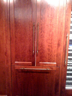
Hey, where did the appliances go?
Some people think appliances should be appliances, and are all in your face about it. I understand I can't hide my ovens or cooktop, but the dishwasher and fridge? Hide and go seek! I like the look of panelled appliances, and plus I think it will also add fun to mealtimes, turning food preparation and cleanup into a fun scavenger hunt.
 |
| Source Yale Appliance. Hello, where might the milk be? |
I think that covers most of our major inspirations and starting points for our new kitchen. I guess it just proves the heart knows what it likes. And just as we love it, YOU may be barely holding down your dinner. That's a-okay---follow your own bliss!
The People want to see some plans!
ReplyDeleteNot sure how to do that---everything's on old-fashioned paper and I haven't a scanner at the moment...I'll see if I can get them emailed!
ReplyDelete